

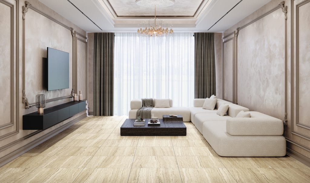
There are several important steps between an image of a single tile and a convincing surface in a render. Incorrect scale, obvious repetition or unrealistic reflections can change the impression of a material more than the colour choice itself. Treat textures as part of the design process, rather than a final decoration for the model.
Identify the exact product first
Record the collection, decor, format and surface finish. A collection name alone is not precise enough for a specification: it may include several sizes and finishes. Link the selected variant to its technical data and organise your working files to avoid confusing similar shades later.
Registered professionals can access tile-face downloads on the Tilezza website. Start at Login for professionals, then open Downloads. Room images provide inspiration; use the appropriate tile-face files to map surfaces in your model.
Set the real-world scale
Match texture dimensions in your software to the selected tile format. A tile should not become wider simply because the image fills a wall more attractively. Aspect ratio, grout positions and cuts around openings must correspond to the planned geometry.
For elongated formats, pay particular attention to pattern direction. With wood-look collections such as Raggio, laying direction can emphasise circulation or connect several zones. Coordinate it with the laying plan, not only the most flattering camera angle.

Control pattern repetition
Repeating a single face across an entire floor often creates an obvious grid. Where different faces are available, arrange them to reflect the collection’s character. Do not assume every product has the same number of variants: use what is available and verified for the particular decor.
Rotating a texture is not always a neutral adjustment. Veins, linear markings and wood grain have a direction. Rotation should follow the intended arrangement and product recommendations. Avoid arbitrary mirroring if it creates an appearance the real material does not offer.
Separate colour from surface behaviour
A tile-face image primarily communicates the visual pattern. By itself, it does not establish relief depth, roughness or reflectivity. If the package contains no additional material maps, set rendering parameters carefully and compare the result with a physical sample and reference images.
Do not render a matt surface as a mirror, but do not reduce it to flat colour without any response to light. Check the material under neutral lighting first, then introduce the atmosphere of the final scene. Strongly coloured light may conceal real differences between two decors.

Connect the render to the documentation
Keep the product name, format, finish, proposed grout and laying plan with the final visualisation. Connect it to the specification so that the client does not approve one image while the installer receives another material.
Before final approval, examine a physical sample. Screens, scene lighting and image processing all affect colour. A render is a powerful tool for agreement, but a real sample remains an important step between the idea and its execution.
Would you like to compare materials in person? Visit Tilezza Concept Space in Belgrade Waterfront, Bulevar Vudroa Vilsona 8v, or in Novi Sad, Futoška 57. For contact details and current information, see Contact.


