

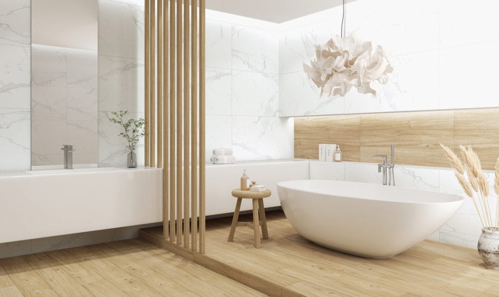
Ceramic tiles inspired by nature allow you to bring stone, wood or marble looks into different parts of your home. But the choice is not simply about a favourite pattern. Consider how much daylight the room receives, the furniture you plan to use and the amount of visual movement you want.
Stone: a calm foundation with character
Mineral markings, subtle transitions and sandy or grey tones create a useful foundation for interiors that put proportions, light and a few selected pieces of furniture first. Such a surface can be understated without being uniform.
Vega and Viento offer two visual directions to explore. Compare a quieter look with finer, more pronounced mineral markings and imagine each across a whole floor or wall. A single sample photograph cannot fully convey the rhythm of a complete surface.
Textiles, natural colours and wooden details can work well with this foundation. If you choose a cooler grey, furniture and lighting can introduce warmth; with a warm base, additional colours can remain restrained.

Wood: warmth through pattern and laying direction
A wood look introduces grain, tonal variation and a recognisable rhythm. Explore that visual language in Raggio and compare it with existing wooden elements in your home.
Wood tones do not all have to match, but their relationship should be deliberate. With a prominent wooden dining table, for example, the floor might be lighter and quieter. Laying direction also changes the perception of a room, so check it on the floor plan before work begins.

Marble: a surface that draws the eye
A marble pattern has a strong visual identity. Cararra is a starting point for a pale palette with veins that bring movement to the surface. Depending on its placement and extent, this motif can be a discreet accent or the main theme of the room.
When using it over a large area, leave enough quiet elements around it. For a single accent, consider the wall behind the basin or a defined interior zone. View several tile faces and agree their arrangement before installation, especially where the pattern will be prominent.
Combine materials with a clear relationship
Wood and marble looks do not have to compete. One can provide the base while the other becomes an accent. The same applies to stone and wood: a shared warm or cool undertone often connects them better than trying to make everything identical.
Create a small palette with the tile, a furniture finish, wall colour and metal detail. View them together in daylight and artificial light. If every sample demands attention, try replacing one with a quieter option.
Once you find the character you want, check the chosen product’s technical properties for its intended application. The material look describes the aesthetic; the appropriate specification confirms where it can be used.
Would you like to compare materials in person? Visit Tilezza Concept Space in Belgrade Waterfront, Bulevar Vudroa Vilsona 8v, or in Novi Sad, Futoška 57. For contact details and current information, see Contact.


